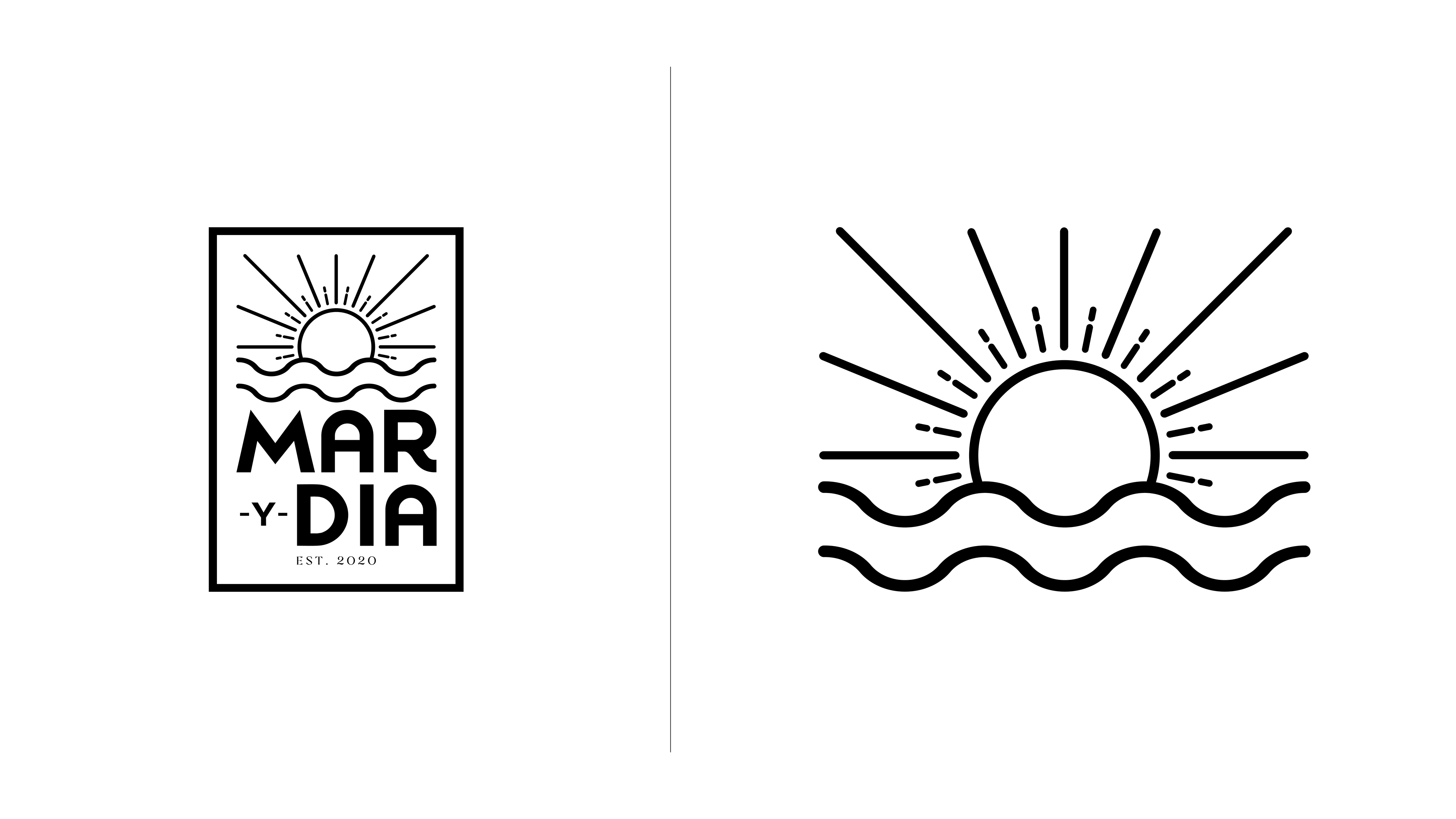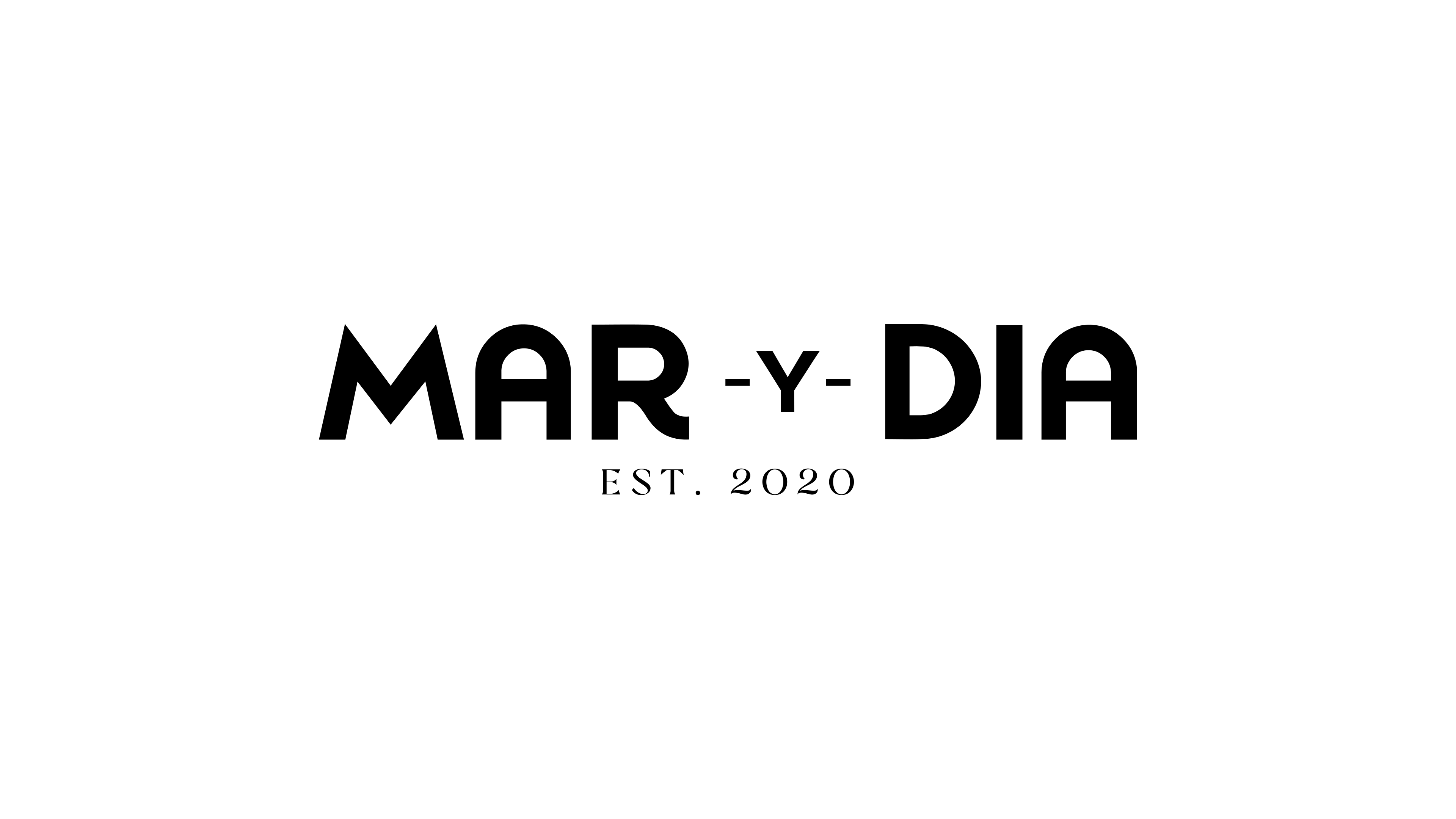
Mar y Dia is a brand born from a blend of instinct and identity. The name is a wordplay on my first and last name, meaning “sea” and “day” in Spanish, and it set the tone for a visual direction that feels effortless, sunlit, and intentionally minimal.
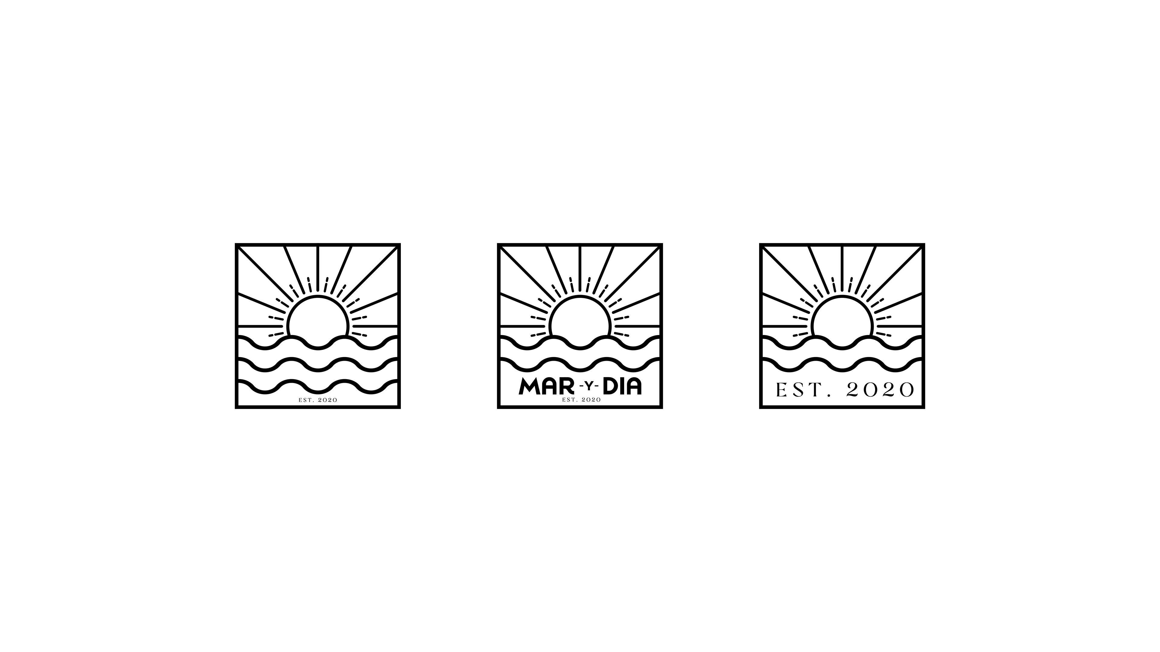
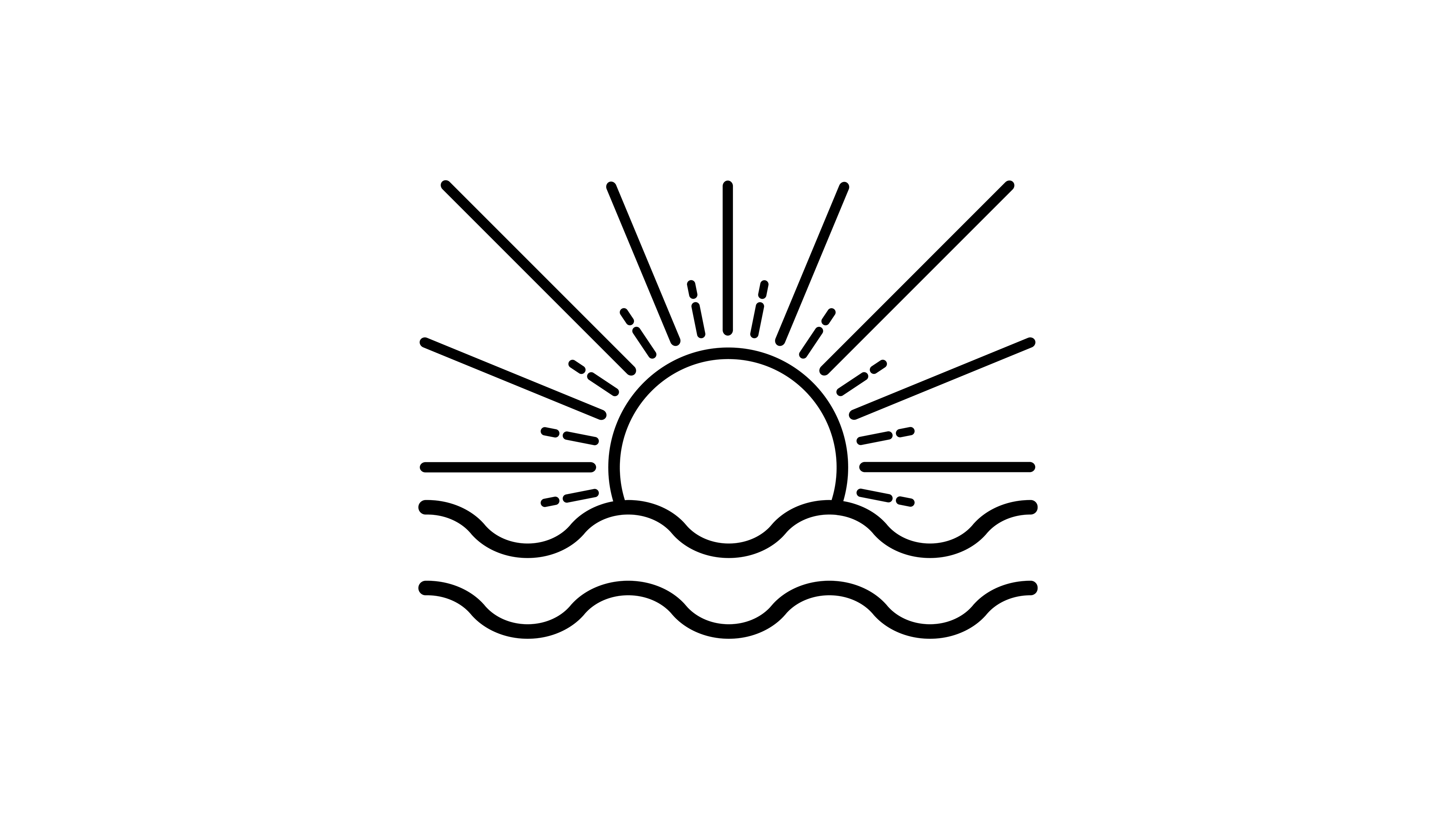
It all started with a quick napkin sketch during a moment of creative downtime. That loose concept evolved into a clean, modern logo system rooted in simplicity. The design captures the essence of a beach day in its most distilled form: light, open, and free. It reflects not only a personal connection to the outdoors but also a refined visual approach I was exploring at the time.
The brand grew from that core mark into a flexible identity system. I created logo variations adaptable for stickers, apparel, and foundational branding across future illustration collections. These collections are set to expand into poster series and clothing drops, each carrying the same balance of spontaneity and considered design.
Mar y Dia represents how a small idea, grounded in authenticity, can scale into something visually compelling and commercially versatile.